Build Up (table and chart)

Contents
This choice displays either a reach chart or a table showing how the current plan accumulates its delivery against the current demo. This is helpful for showing whether a plan is nearing the maximums possible with its complement of components, dayparts and networks.
Build Up Curve
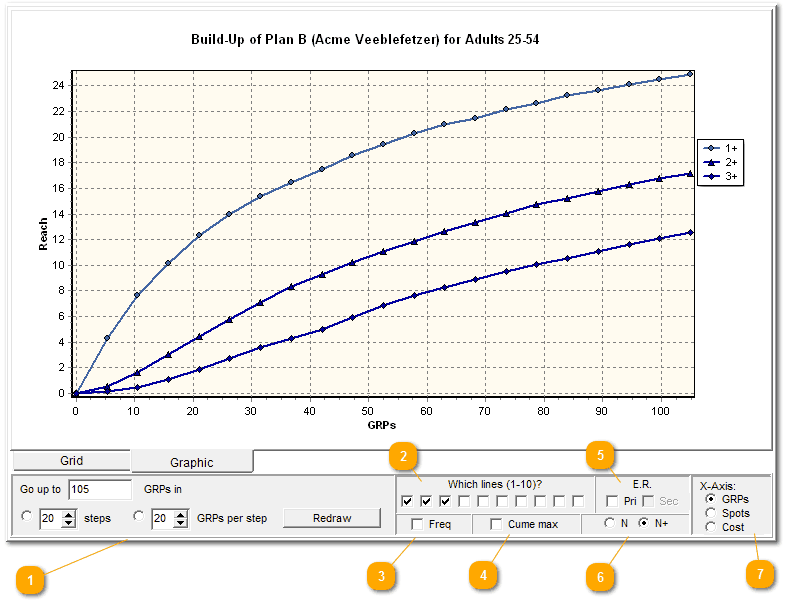
This gives you control over the GRP range and the number of steps to be plotted. As an example, if you have a plan that is to air over a 10 week period, you might like to show 10 steps. Make your desired change, then click "Redraw".
|

If you wish, you can show the overall 1+ reach line, as well as 2+, 3+, 4+, all the way up to 10+. Or not! Use these ten boxes to note which lines you want included.
If you need a line for a frequency greater than the 10 level, you can do that by setting a primary or secondary Effective Reach value and checking the appropriate box, as shown in bullet point 5, below.
|
Add a supplemental line that shows how frequency grows over time, rather than reach. Check the "freq" box, and a green line shows how frequency grows across the life of the plan:
|
The curve says your reach is growing, but what's the ceiling? How high can the reach grow? This check box draws a horizontal line to show that maximum.
|
Add an emphasis line to show how effective reach grows.
|
You won't need this much, but it's handy in special situations.
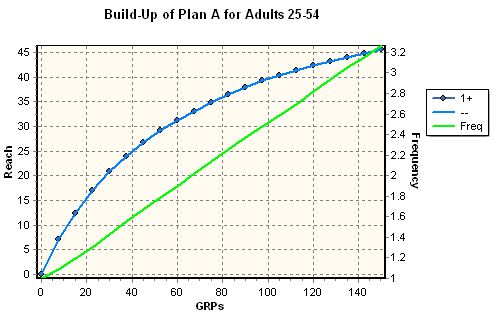
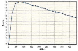
Usually, a classic reach curve shows how reach accumulates over time, and the most basic plot is the curve for the growth in 1+ reach. That is, we show how we gather an audience exposed one or more times. But suppose (for some reason, or an analytical puzzlement, or a client question) we are wondering, "What happens to the number of people exposed exactly once over the life of the plan?" Use this little panel to handle that question by clicking on "N".
Here's a comparison of the difference. Here is a typical reach curve, showing how the 1+ reach grows:
Now click that "N" button. This is the exact same plan, but now we're showing what happens to audience at the exact 1 level, not 1+:
The number of people exposed exactly once climbs as the plan takes off. As the plan continues to roll out, people are then seeing our campaign two or three or more times. In other words, they are no longer in that "exactly once" group! But as long as we still get fresh new audience, the "exactly once" group grows. But in this illustration, once we have some 70 or 80 GRPs on the air, more people are moving up to higher levels of exposure than are being added for the first time, so the reach curve for "exactly once" starts to decline. Since it's a goal to get more people more exposed in order to communicate our message better, this decline can be viewed as a good thing.
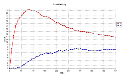
You can add the other lines (2, 3, 4, and so on) for even more details. This shows how the portion of the target reached at effective levels is increasing while the portion of people reached merely once is decreasing, as the schedule rolls out:
|

This just labels the X-axis to tell the story the way you wish to tell it. |

Also read the section on Graphic Widgets about formatting, adjustments and edits you can make to this chart.
Build Up Table
A companion "Build Up Table" command displays the same results as a table:

This is especially handy to have a quick look-up table.
There Are No Stored Reach Curves!
Please note! There are no stored reach curves in TView!
Internally, TView is a completely respondent-based system, and so it has no need for any stored, static reach curves. Another way of saying this is that the graphic curves are drawn based on numeric results produced by TView, rather than having numeric results being taken from stored curves. The reach curves that TView shows in this display are all generated fresh, from exactly the definitions you create for a database.
What If I Want to Show Curves for Each of the Elements of a Plan?
TView has two different panels for showing reach curves, "Build-Up" (shown on this page) and "Curves". These two panels both produce graphics with reach curves. So, what's the difference?
"Build-Up" (shown on this page) shows how reach accumulates for a whole plan, with different lines to illustrate the growth at different effectiveness levels. You can use this to show how a plan builds audience over time.
"Curves" compares the individual elements within a plan, and shows how they individually build reach. The actual plan specs are ignored; all that matters is what elements are in the plan. These can be dayparts, networks, groups of programs, or whatever else you have as lines on the plansheet. This is used to document the specific strengths of elements in a plan, or elements you are considering versus other elements.