Graphic Widgets

Contents
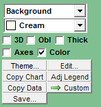
For graphic reports such as bar charts and reach curves, a cluster of widgets appears in the lower left of your document:
Copying and Saving Graphics
Copy Chart |
Copy the current graphic to the system clipboard. From there you can paste it into Word, Excel or elsewhere. |
Copy Data |
Very cool. This copies the actual numeric values used to create the graphic. You might use this to paste values into Excel and create any kind of chart you want, or to do further special analyses. |
Save ... |
Instead of putting the graphic or data on the clipboard, this saves it to a file. You will be asked if you want to save a graphic or a text file of values. |
Making it Prettier
Or uglier, if you so desire. Beauty is in the eye of the beholder. Here are some things you can do:
"What" popup |
What element of the graphic do you want to re-color: the background, a select plot line, the axes, etc. |
Color popup |
Choose a color for the selected element |
3D |
Make it pop. Or not. |
Obl |
Set the graphic on an oblique. Once you set a graphic to 3D and oblique, you can drag it around with your mouse for different angles and views. |
Thick |
Thicken up the plot lines for clarity |
Axes |
Show or remove all axis labelling |
Color |
Use color, or black and white (for printing) |
Theme |
Choose from a variety of pre-designed themes |
Edit |
Use a comprehensive editing tool to do untold wonders to your graphic |
Adj legend |
Where does the legend go: right, bottom, left, top, or gone! |
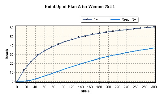
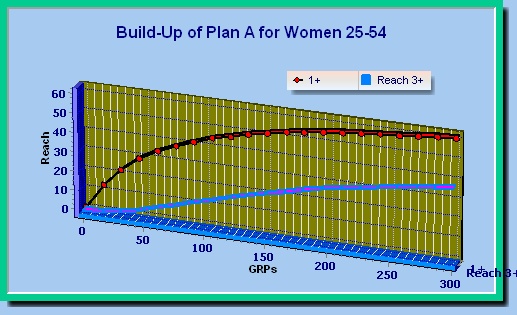
Here's a before-and-after of the same reach curve graphic:
Custom Charts
You can combine graphics in all kinds of interesting ways with the ![]() button. Read all about it here: Custom Charts.
button. Read all about it here: Custom Charts.