Effective Reach

Contents
On the "Settings" tab you can define what you want as "effective reach" for this plansheet. (Go to the Definitions topic for an explanation of what this means.)
Just set the control to your plan needs:
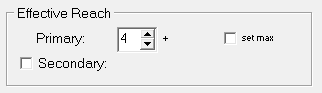
If you'd like to show effective reach in two ways, perhaps both 3+ and 5+ for example, you can set a secondary definition of "effective reach" with this:
![]()
What does it mean to “Set Max”?
The checkbox labeled “set max” which can be used to set the maximum frequency that is allowable for a respondent to be tallied as “effectively” reached. For example, a planner could say that "effective" is defined as "from 3 to 10" exposures.
![]()
But before you use this option, you should carefully consider if you really want to define “Effective Reach” this way!
Here's the concern: By setting a max ER of 10, say, you're telling TView that a person who has 11 exposures is of no value at all and should not be counted. Hmmm, that doesn't sound right, does it?
The rejoinder to that would be, "But in an optimization, we need to have some way to tell the system to try to go for new people, and not to keep on piling on frequency." Well, that's already in place; it's our conventional definition for the starting point of ER, such as ER=3+. When TView (or most any other system for that matter) is trying to increase an ER goal such as “3+”, the only way it can do that is to find schedules that deliver more impressions to those lightly exposed, so that they get up to that minimum. Thus, the system already has an incentive to not pile up frequency at the high end.
A planner might argue, “But the 15th exposure is worth less than the 10th exposure, this is just common-sense diminishing returns.” That’s true, we agree, but that is not what setting a maximum frequency level for ER accomplishes. The difference is this: The 15th exposure is certainly worth less than the 10th, but a person who has been exposed 15 times is not worth less than a person who has been exposed 10 times.
A valuable way of looking at this compares the distribution of the number of people at each level of exposure, versus the distribution of the number of impressions delivered to those people. (You probably have not seen this in other media systems.) To explore this, jump to the topic Frequency Distribution (chart)
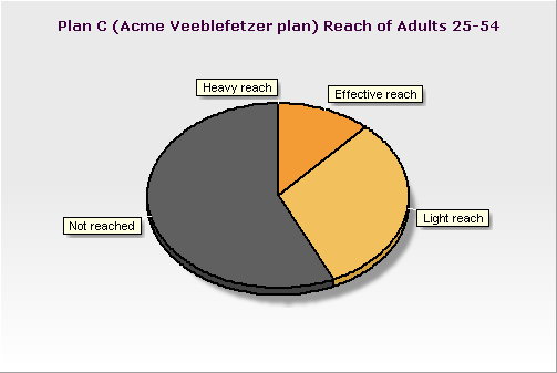
One exception comes to mind. In the ER pie chart (shown below), if you have a "Set Max" set for your ER definition, the pie chart will show an additional segment for "Heavy Reach". This might be useful for presentation purposes.
Pie Chart of Effective Reach
A simple chart of who has been reached at an effective level is available on the Details tab, on the "Reach/ER" line.