Compare Curves

Contents
This panel provides a way to view and compare the "reach curves" for different line items in a TView plansheet. These "reach curves" illustrate how individual networks, dayparts or other components accumulate audience over time, showing where growth is quickest, and where it tends to level out.
Here are some ideas of how you might use this chart:
| • | show how three cable networks compare |
| • | show how two different dayparts compare |
| • | show how Tuesday night delivers differently from Thursday night |
| • | show the pattern of accumulation for several different groups of specific program titles |
| • | have I used one network to its maximum reach-building potential, while there is still room to grow on other networks? |
It's simple to make reach curve comparisons with this display: Make sure that all the elements that you wish to compare (networks, dayparts, or whatever) are all present on a plansheet. Into any plan column, enter any GRP value for each of the elements you wish to compare. (Indrawing each curve, TView does not use the value of this entry, but the presence of an entry denotes that you want the line in this graphic.) Then go to the "Details" tab, and click on the "Curves" button.
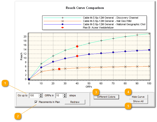
So that they can be compared, all of the curves are plotted to go up to the same maximum. Use the entry boxes on the bottom to revise that maximum GRP level to be plotted, or to change the number of steps to be drawn. When finished, click on the "Redraw" button.
The reach curves tell how the entries build reach. Who is most able to accumulate audience, and who seems more specialized? Do some dayparts (or networks, or whatever) meet their maximum potentials earlier than other options? Is one a slow build, while another takes off dramatically and levels out fast?
Note that questions like these tell about the inherent reach growth of each item on its own merit, without regards to your current plan.
While the reach curves tell us how the entries compare in accumulation, they don't say anything about your current plan. To do that, check "Placements in plan". That puts a red dot on each curve to show how the current plan makes use of each element.
In the illustration above, we able able to learn how these three cable nets grow in reach over time, all the way up to 100 GRPs. "Placements in plan" is checked, so there is one red dot on each line. We see that 40 points have been entered for Discovery and for National Geographic, and 25 points are on Nat Geo Wild. Seeing the curves with these red dots gives us a nice, quick overview of our plan's usage of these networks.
|

Don't like the colors of the lines? Click this until you find a more pleasing combination!
|
Don't want to show the mediocre results of the Flyfishing Channel? You could just change your plan, but this is a quick way to remove a line: click it to select it, then click this.
|
If you've hidden one or more lines, this brings 'em back. |
Also read the section on Graphic Widgets about formatting, adjustments and edits you can make to this chart.
There Are No Stored Reach Curves!
Please note! There are no stored reach curves in TView! Internally, TView is a completely respondent-based system, and so it has no need for any stored, static reach curves. Another way of saying this is that the graphic curves are drawn based on numeric results produced by TView, rather than having numeric results being taken from stored curves. The reach curves that TView shows in this display are all generated fresh, from exactly the definitions you create for a database.
What If I Want to Show a Reach Curve for the Plan as a Whole?
TView has two different panels for showing reach curves, "Build-Up" and "Curves" (shown on this page). These two panels both produce graphics with reach curves. So, what's the difference?
"Build-Up" shows how reach accumulates for a whole plan, with different lines to illustrate the growth at different effectiveness levels. You can use this to show how a plan builds audience over time.
"Curves" (shown on this page) compares the individual elements within a plan, and shows how they individually build reach. The actual plan specs are ignored; all that matters is what elements are in the plan. These can be dayparts, networks, groups of programs, or whatever else you have as lines on the plansheet. This is used to document the specific strengths of elements in a plan, or elements you are considering versus other elements.