Quintiles and N-Tiles

Contents
This panel divvies up your target audience into groups. You can choose how many groups, but the most common practice is to request five groups, called quintiles.
These groups are organized in a way that has something to do with either:
| • | people's exposure to a plan, or |
| • | their use of a medium (or part of a medium) in general. |
Quintiles, terciles, deciles, etc.
![]()
The default is to break the audience into five groups called quintiles, but if you prefer, TView can show terciles, quartiles, deciles or other groupings.
Roman numerals are traditionally used for labels. Quintile I is the "heavy" group that has been most exposed or uses the medium the most, whereas Quintile V is the "light" group. If we are talking about exposure to a plan, there may also be a "leftover" group of the people in our target who have not been reached at all.
Forming Groups
Depending on the data source, TView has two different approaches to forming n-tile groups, either:
| • | create groups using plan exposures: |
- who has been most heavily exposed to this plan?
- who has been most lightly exposed to this plan?
| • | create groups using some measure of media usage: |
- who are the heaviest users of this medium?
- who are the lightest users of this medium?
Both are discussed in the next sections.
N-Tiles of Plan Exposure
![]()
When "Plan Exposures" is chosen, TView takes the total group of people who have been exposed to the campaign, and breaks them into equal-sized groups according to how many spots they have seen from this plan. So, Quintile I is the 20% who are mostly heavily reached by that schedule, Quintile II is the next 20% and so on.
When to use this: Use "Plan Exposures" when you want to learn more about how many people are heavily -- perhaps too heavily -- exposed to your plan, and how many are lightly -- perhaps too lightly -- exposed. It's a fast and compact alternative to a frequency distribution. |
Note what this implies: Let's suppose that the reach is 43.9. Since we're breaking people into fifths (groups of 20% each), that means that our first two quintiles (20+20) will contain only people who have been reached. (20+20). That means that everyone in Quintile I and Quintile II has been reached, that is, reach = 100. So, there is no difference in the reach for Q1 and Q2, as everyone in both groups has been reached. We have a little reach left over (43.9 - 40 = 3.9) so there will be some reach in Quintile III (3.9 out of 20 is 19.4%).
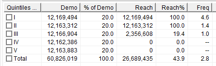
A significant finding of this report is that the 20% of our target that has been most exposed to our plan have seen 4.6 spots, on average.
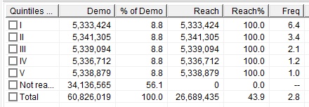
You can choose whether the whole universe of your target should be divided into equal groups, or if those not reached at all should be lumped into a separate "leftover" group.
![]()
TView divides the reach of 43.9 into five groups of 8.8 each. Everybody in all of these groups has been reached (reach = 100). Since the total reach was 43.9, the "leftover" unreached group must be 56.1% of the target (100 - 43.9).
N-Tiles of Media Usage
It's different when we ask something like this: How does our planned schedule perform against the people who watch the most TV, or those who watch the least TV?
When to use this: Use some measure of media usage when there is concern if a plan is reaching the lighter users of a medium, or if some heavy viewers of the medium are getting battered with too many exposures. |
TView has several built-in media usage choices. These are available for person demos only (i.e., not households), and only when using either Nielsen All-Minute or Mid-Minute data for October 2014 or after.

Built-in choices include total volume of usage of either television or the Internet, or the portions of the medium as shown.
These built-in choices are defined in terms of the current demo target. For example, if your target is Women 25-54 and you choose "Total Television Usage", then Quintile I is the 20% of women who are 25 to 54 who watch the most television.
But what if ...
... you want some other definition of media usage than is shown here?
... you're using some other data source, such as IBOPE, or Canadian Numeris?
... you want the demographic for media usage to be households, not persons?
... your plan target is one demo, but you want the basis of media usage to be something else?
In all of those situations, you can still create your desired quintiles. See the section "Custom Media Usage Groups", below.
Results
Let's look at a sample plan and see what the n-tile report tells us:

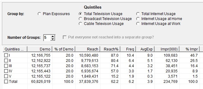
Going to the Quintile/N-Tile panel and choosing "Total Television Usage", we get this report:
The columns show these measures:
Column |
What It Is |
Example (from above) |
I...V and demo counts |
The count of persons in each group. |
We've divided our reach audience into five groups, each containing about 12,166,000 people. |
% of Demo |
This is the percent of the total demo target that is in this group. |
In the example, we have five quintiles, each consisting of 20.0 percent of the target. The groups total 100 percent. |
Reach |
The number of persons in this group who were reached. |
Quintile I is the 20% of the demo who watch the most TV. There were 12,166,755 people in that group, and we reached 10,590,480 of them. |
Reach % |
The percent of persons in this group who were reached. |
10,590,480 of 12,166,755 is 87.0 percent. |
Frequency |
The average number of exposures among reached persons within this group. (That's the normal definition of "frequency".) |
Those people in Quintile I who were reached saw our campaign an average of 10.4 times. |
AvgExp |
The average number of exposures among all persons within this group (including those, if any, who were not reached at all) |
If the whole quintile group has been reached, then this is the same as the frequency. But if the quintile consists of some reached and some not, the frequency is computed only among those reached, while the "AvgExp" is computed from the whole group. |
Impr (000) |
A count in thousands of the number of impressions delivered to persons in each group. |
109,683,000 impressions were delivered to the persons in Quintile I. |
% Impr |
Of all impressions delivered, this is the portion going to this group. |
About 46.7 percent of impressions went to Quintile I, in this example. |
Quintile/N-Tile Chart
A separate panel reports your quintiles or n-tiles as a chart:
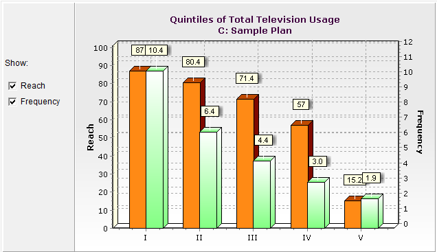
You can choose whether to show bars for reach in each n-tile, or frequency, or both.
Quintiles and Wearout
A common reason to look at quintiles is to make judgments about wearout. Wearout is defined (by some) as the point at which delivering more advertising to a viewer has no further influence on their purchasing decisions. Others might say that wearout is when more advertising is actually harmful, as when a viewer sees so many of your spots that a negative reaction results.
Several formulaic definitions of wearout are passed around as media lore. For example, someone might say that wearout is defined as when the top quintile of exposure to your campaign has seen your ad 15 times or more. Our recommendation is to treat such advice as valuable if you can also translate it to common sense terms. For example:
Q: How many times does a person have to see an ad before we can expect no further reaction?
A: Oh, I don't know. Maybe 15?
Q: OK, sounds good! Now how many people have to be at that level before I consider this to be a big problem?
A: Well, it has to be more than just a few people. But if half the target is at that level I'm way past the point of it starting to be a problem. So, let's say, maybe, 20%?
Q: So, we just defined wearout as a frequency of 15 or more on the top quintile.
Now, your estimates may vary. But the point is to build an understanding of what wearout means to you, rather than just taking a formula at face value.
If you do think that wearout is becoming a problem, there are several strategies you might consider to remedy this. First, if you influence the commercial pool policy, wearout concerns are a good reason to consider having more creative executions. (TView has a capability called Copyreach that can help you with this.)
Other strategies might include expanding the number of dayparts or networks you use to expand your reach rather than piling up impressions in one place. Take a look at the Contributions report to see which line-items in your plan might be getting saturated. Also consider using the Optimize command to explore possibly better balances of your plan elements.
Make TeleDemo: Defining New Demos Based On Quintiles
![]()
It is possible to define a new demographic based on quintiles or n-tiles. For example, you could define a new demo "Women Hvy Intro" to denote those women who were in Quintile I or Quintile II for your introductory flight. You could then use this demo when inspecting results for some other plan, thus letting you learn (for example) what portion of these women are reached by your sustaining flight.
To do this, read more in the TeleDemo topic of this Planner's Guide.
Custom Media Usage Groups
As described above, TView offers built-in media usage choices for some data sources, and with some definitions.
Here are some occasions when you may like to create customized media usage groups:
| • | a specialized definition of a television group: for example, look at delivery by quintiles of sitcom viewing or quintiles of network sports viewing, or heaviness of viewing prime-time television |
| • | when using some other data source, such as IBOPE for Latin America, or Numeris for Canada |
The approach is this:
| 1) | Create a separate plan that describes the medium you want to use as a basis |
| 2) | Look at Plan Exposures for that plan |
| 3) | Use TeleDemo to define the heavy to light groups, as needed |
| 4) | Evaluate your "real" plan against thjose TeleDemos |
As an example, let's create quintiles by usage of prime-time broadcast television.
First, let's start with a really, really big plan that includes what we want as our base. It can be a detailed plan, but for our example of prime time broadcast, it'll just be a single line:
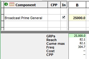
We'll use this to determine who are the heavy prime TV watchers and who are the light watchers. Note that it does NOT matter how heavy a schedule we put in, other than it's really heavy and that it captures most broadcast prime TV. The reason is that all we'll want this for is to put the respondents in order from heavy to light.
Now go to the Details tab, to the Quintiles panel.
Choose "Plan Exposures", because we want to sort people by how much they watch broadcast prime.
UNcheck the "Put everyone not reached into a separate group" box. If someone hasn't been reached by the big schedule, then they certainly qualify as a light viewer for this purpose.
Now we define a Quintile I TeleDemo based on that honkin' big schedule. Check the Quintile "I" box, and then "Make TeleDemo":
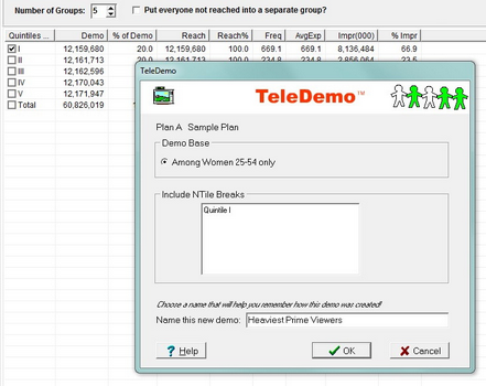
OK, that identifies who are the heaviest TV watchers.
Let's return to the Table view, and put in our own "normal" schedule as a new plan:

Our plan gets a 62.2 reach overall.
Now we can see what we've gotten! Click on the "Demos" display here:
![]()
and make sure we're looking at OUR plan, plan C.
Then we see this:

So our plan got a 62.2 reach overall, but it was seen by 99.7% of the heaviest viewers of broadcast prime-time TV.
You can repeat these steps to get the other quintiles.