Custom Charts
Suppose you want something like these:
| ❖ | Compare the frequency distribution of your introductory and sustaining flights |
| ❖ | Compare the reach curves of men and women |
| ❖ | Compare how reach grows among your product users (using MRI data) versus all people |
You can make such charts using the custom charts panel on the Details tab.
![]()
"Custom" is a catch-all capability to create a variety of graphics that aren't explicitly listed elsewhere in TView. With this, you can combine reach curve plots however you wish! You can use curves from either the "Build Up" or "Curves" panels. For example, you might want to show a comparison of the Build Up plots for two different plans, or to compare plans before and after some revision, or to compare reach curves for a media element for several different demos.

How to Make Custom Charts
You can combine plotted lines from the "Build Up" and "Curves" charts, as well as the other charts, to make your own customized charts. Here's what to do:
| 1. | Go to the "Build Up" or "Curves" panel |
| 2. | Select the series you want by clicking on any of the plotted points |
| 3. | Click on the |
| 4. | Add more series, as you wish |
| 5. | Return to this "Custom" panel |
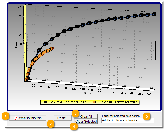
To start over, click on "Clear All" to remove all of the plotted series.
To those who don't read manuals (not you, apparently, dear reader!) it's mystifying to see an utterly blank chart. So, we give them this button to at least get a clue about what's going on.
If you used "Copy" to copy a chart series somewhere, click Paste to add it to the custom chart. Even easier, in the base chart select the series and click the ![]() button, which copies it directly to the "Custom" chart.
button, which copies it directly to the "Custom" chart.
Remove any series in the chart by selecting it, and then clicking this.
Remove all series from the chart.
This gives you a chance to name or rename how a series is identified in the legend.

