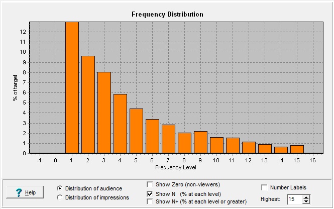
Frequency Distribution (chart)

Contents
Also see: Frequency Distribution Table
Available goodies:
|
Choose to show: - how many people are at each level of exposure, or, - how many impressions are going to persons at each level of exposure. (See the discussion below.) |
|
Do you want to show a bar for the persons (or impressions) at the zero level? |
|
Usually, people show one bar for each level: Audience seeing exactly 1 spot, seeing exactly 2spots, etc. But if you instead want those seeing 1 or more, 2 or more, etc., you can do it. |
|
Attach a numeric label on each bar? |
|
How high up should we go with the bars? |
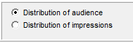
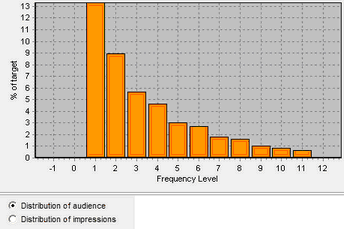
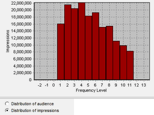
Distribution of Audience vs. Distribution of Impressions
By default, this chart shows how many people in the target are at each level of exposure. You can quickly see how big a group saw your ad once, twice, and so on. This is a very traditional way of looking at a frequency distribution. It's also the most practical for understanding the breakout of your target, who has not yet been well-reached, who is getting there, who is at some notion of an effective level, and perhaps who has gone beyond into some wearout level of exposure.
Some people looking at a chart like this initially may be disturbed by the very first bar at level 1. "Gee, that seems like a lot of people I'm paying for who aren't really being exposed properly." If that concern is raised, showing the frequency distribution by impressions may be helpful:
Also read the section on Graphic Widgets about formatting, adjustments and edits you can make to this chart.