Frequency Distribution (table)

Contents
Also see: Frequency Distribution Chart
This panel shows the full frequency distribution:
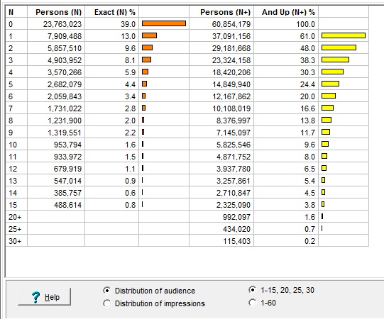
The first column identifies the frequency level: The line labeled "5" has information on persons exposed to our campaign five times, the line "20+" is about people seeing the campaign twenty times or more. Here's what's going on in the other columns:
Column |
What It Is |
Example (from above table) |
N: |
Number of spots seen |
The first row above tells us about people who saw 0 of the spots in our schedule (that is, they missed the campaign completely). |
Persons (N): |
The number of people in our target who see exactly the stated number of spots |
4,903,952 people from our target saw our ad exactly 3 times. |
Exact (N %): |
This percent of our target has seen the ad this many times exactly. |
8.1 percent of our target has seen our ad exactly 3 times, no more and no less. |
Persons (N): |
The number of people in our target who see at least the stated number of spots |
23,324,158 people from our target saw our ad 3 or more times. |
And Up (N+ %): |
This percent of our target has seen the ad this many times or more. |
38.3 percent of our target has seen our ad 3 or more times. |
Audience or Impressions?

There is a discussion of this choice and why it's useful in the next topic about the frequency distribution chart.
How Much Detail?
![]()
By default, step-by-step results are shown for frequency levels from 1 up to 15, and higher levels are grouped together. But, if you really want to see all the detail, you can request it by clicking the "1-60" button.